
4 Ways to Add Shadow and Depth To Your Digital Lettering
In my last blog post, I gave y’all some insight into my favorite digital lettering essentials and what tools you can use to expand your artistic skillset, and now I'll show you how to use a few of those tools to add depth to your hand-lettering. Shadows are a fantastic way to add interest, dimension, and life to your letters, and are one of my favorite decorative elements to use. Getting to know different types of shadows and how they work is a great skill to have in your mental toolkit!

I'll be using an 11 inch iPad Pro, 2nd Generation iPad pencil, and the Procreate app for this lesson, but you can apply most of these principles, tips, and tricks with your favorite lettering mediums.
Note: Some of the links in this post are affiliate, and if you go through them to make a purchase, I might earn a small amount of revenue. Whether or not you decide to buy something is completely up to you. :)
Get To Know Shadows
It is a truth universally acknowledged that shadows should and will appear on the opposite side of the light source, i.e. if your light source is on the northeast side of your letters, the shadow should fall on the southwest side of your letters. This tends to confuse a lot of people (myself) included, so I find that it helps to use dot grid or graph paper to help map out the angle of your shadow.
Shadow vs. Shade
Shade can refer to any dark area in which light is blocked. Shadow refers to the dark shape that appears on a surface when an object blocks light. Think of it this way - shade doesn't always have a definable shape, such as when you sit under the shade of a tree. But that tree's shadow has a shape - it's the shape of the tree.
Drop shadow: Think of it as if the letters are floating above a surface and casting a shadow, which is that dark shape on a surface. A drop shadow can be sharp or blurry, darker or lighter.
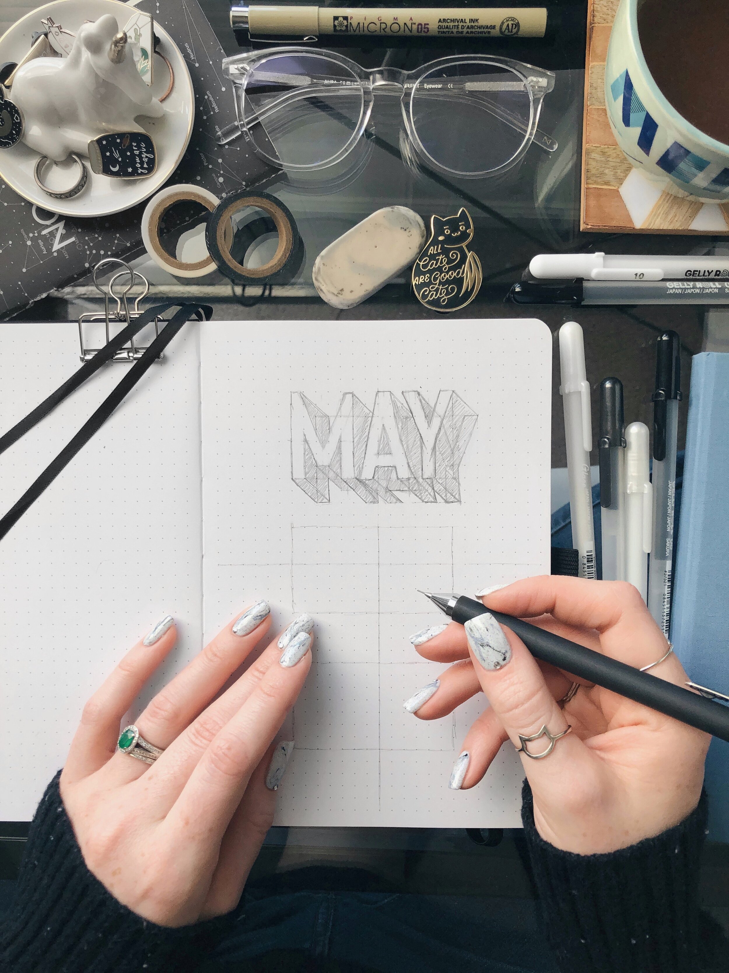
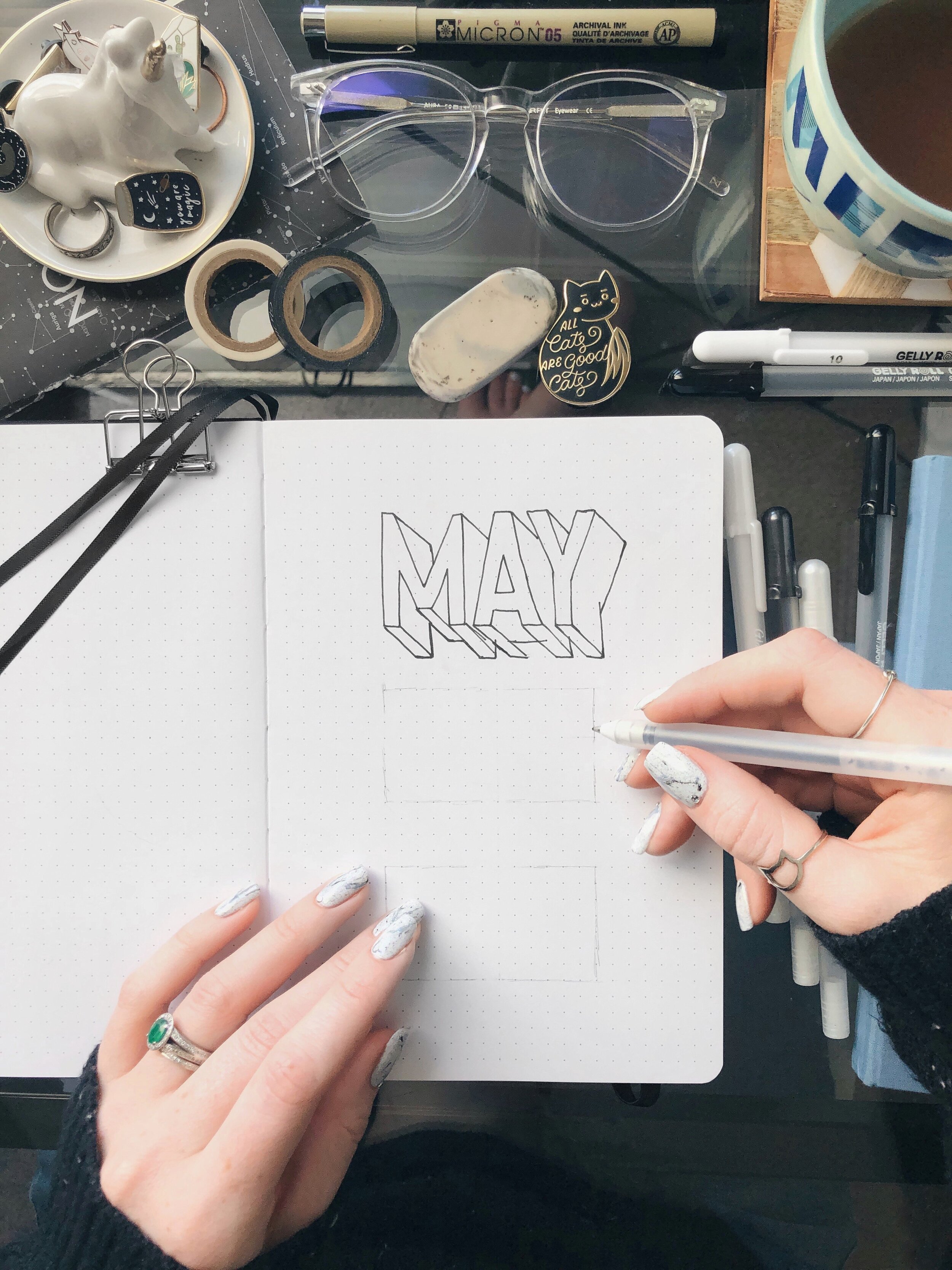
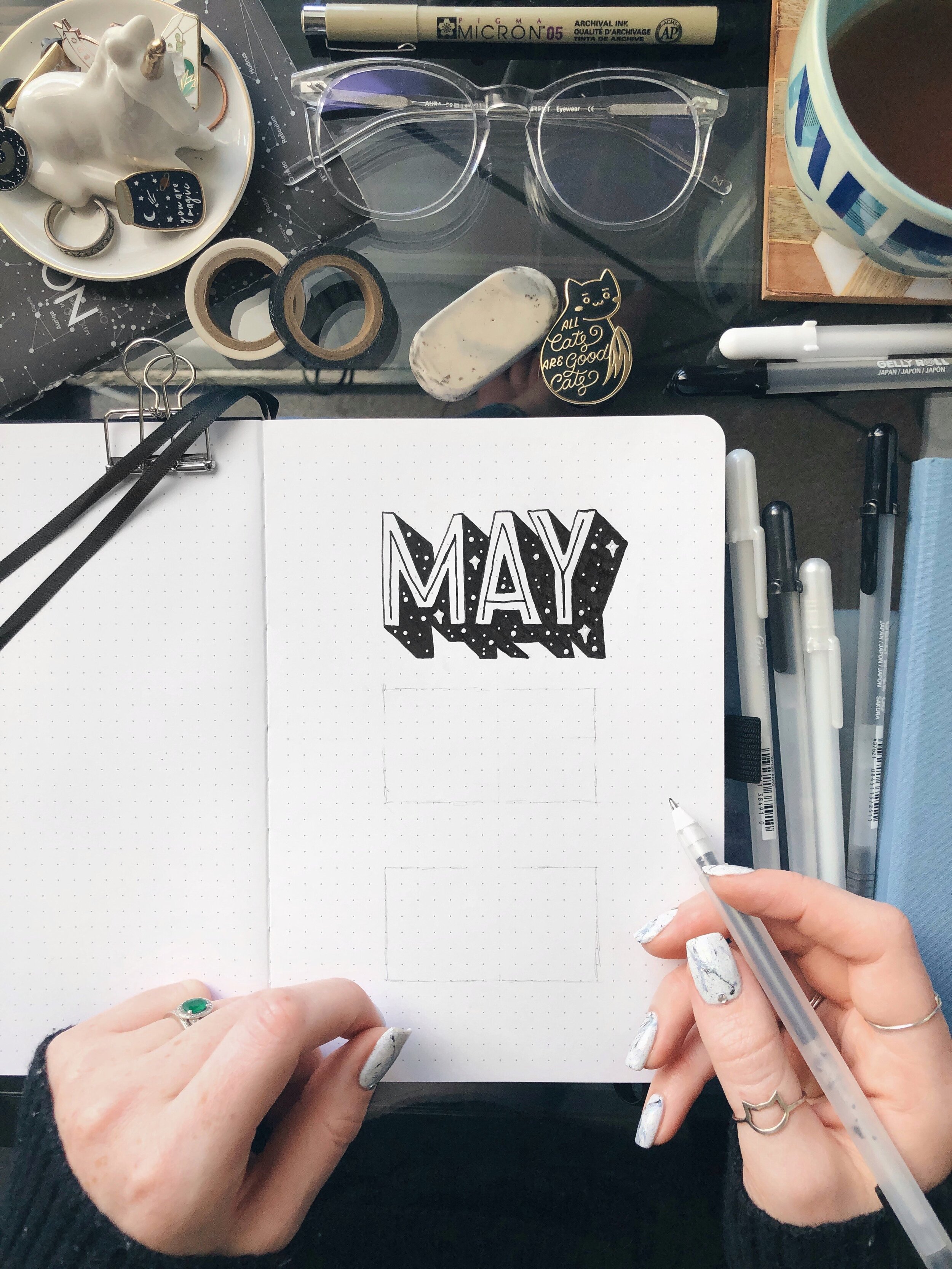
Drop shade: Unlike a drop shadow, the drop shade (sometimes called closed shade) is closed at its corners, which appears to give the letterforms thickness. It is often used by sign painters to give letters extra dimension and personality. This is what I used in the “May” design above.
Long Shadows: This particular shadow style is often paired with flat design, especially for text and icons. Long shadows generally extend off the edge of the design/canvas.

Now that you’re familiar with a few terms, let’s get into the details of adding shadow and shade to your lettering. All the Procreate brushes I’m using in this post can be found here for 50% off, thanks to my friends at Design Cuts!
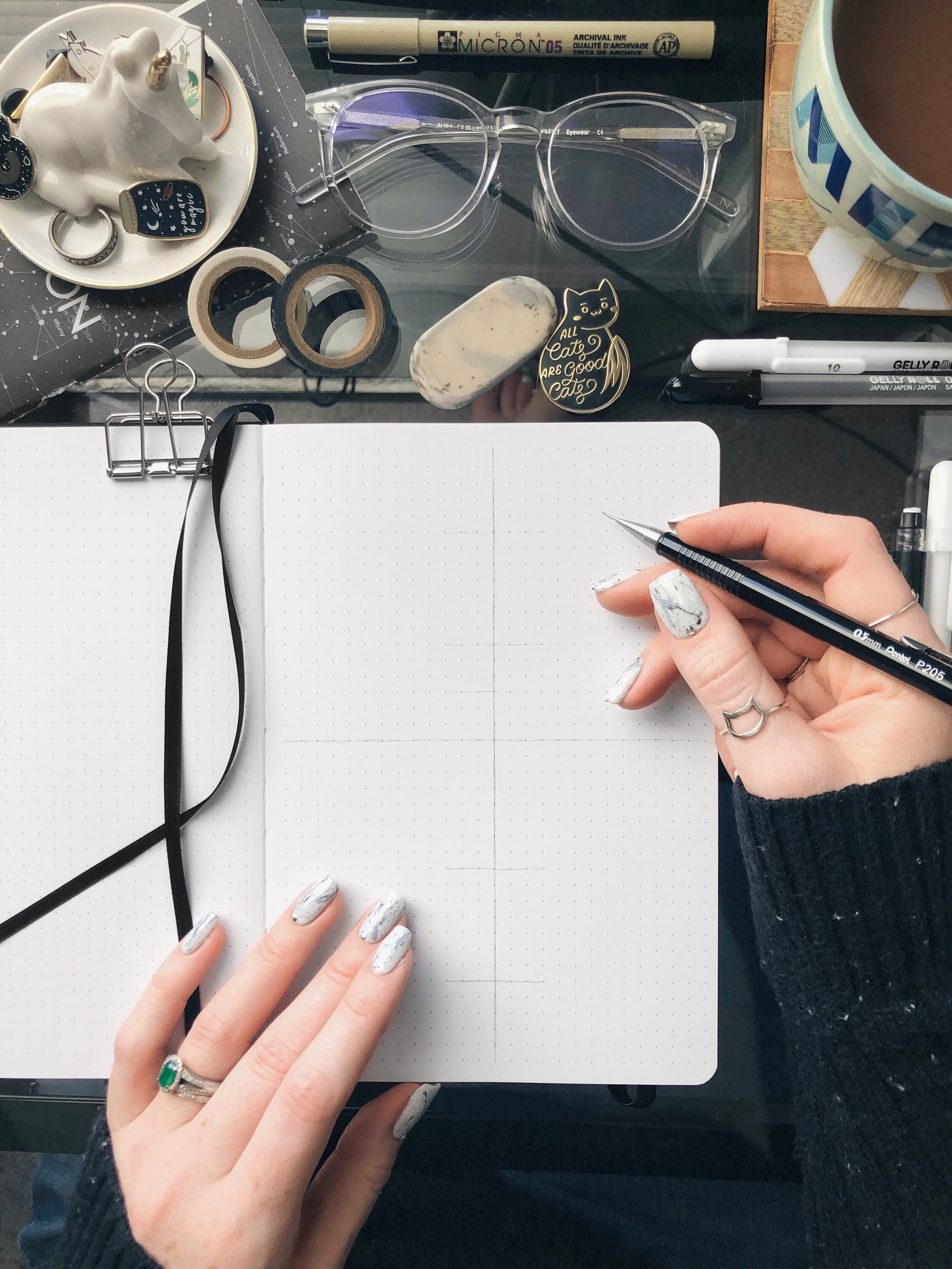
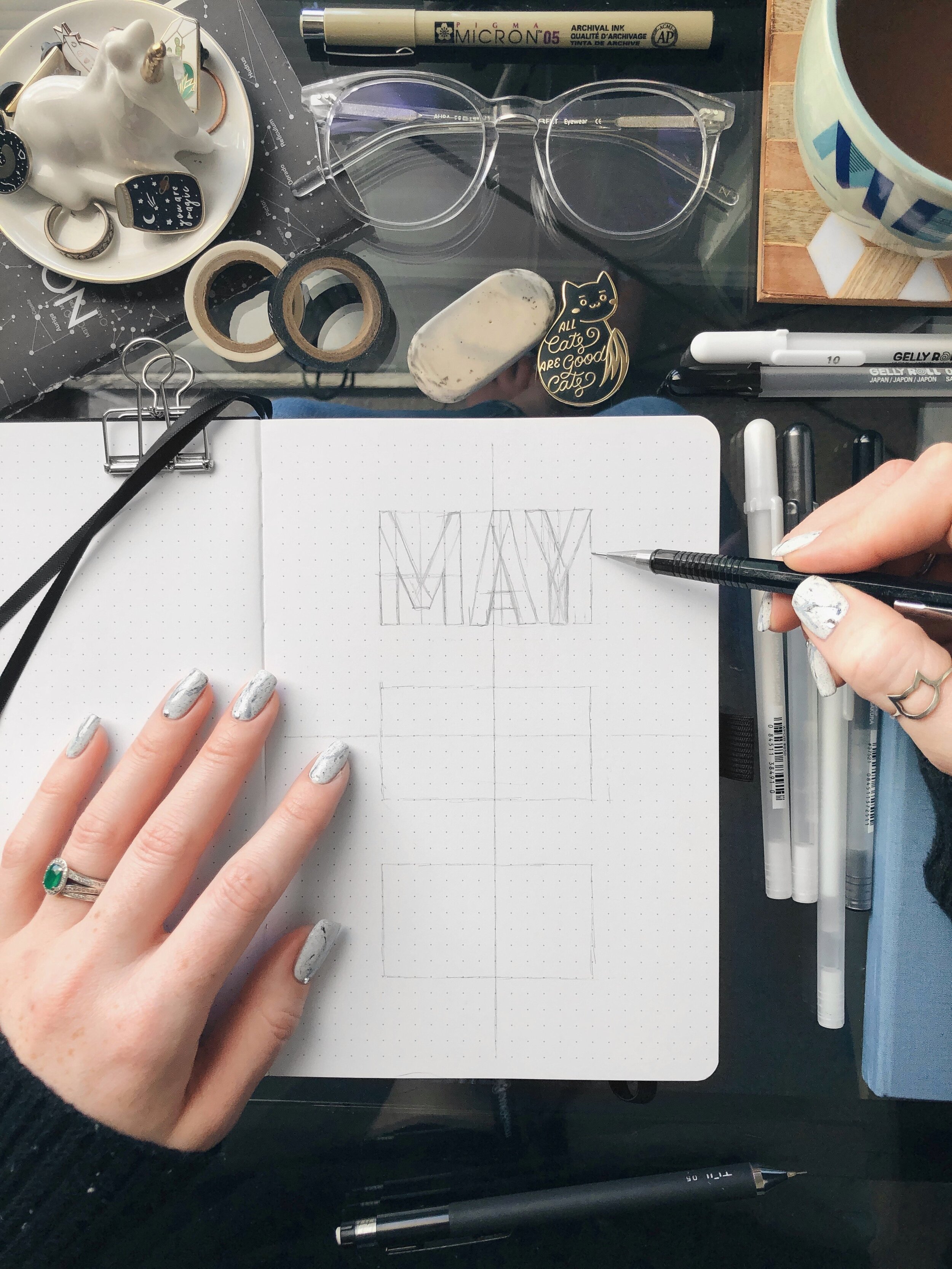
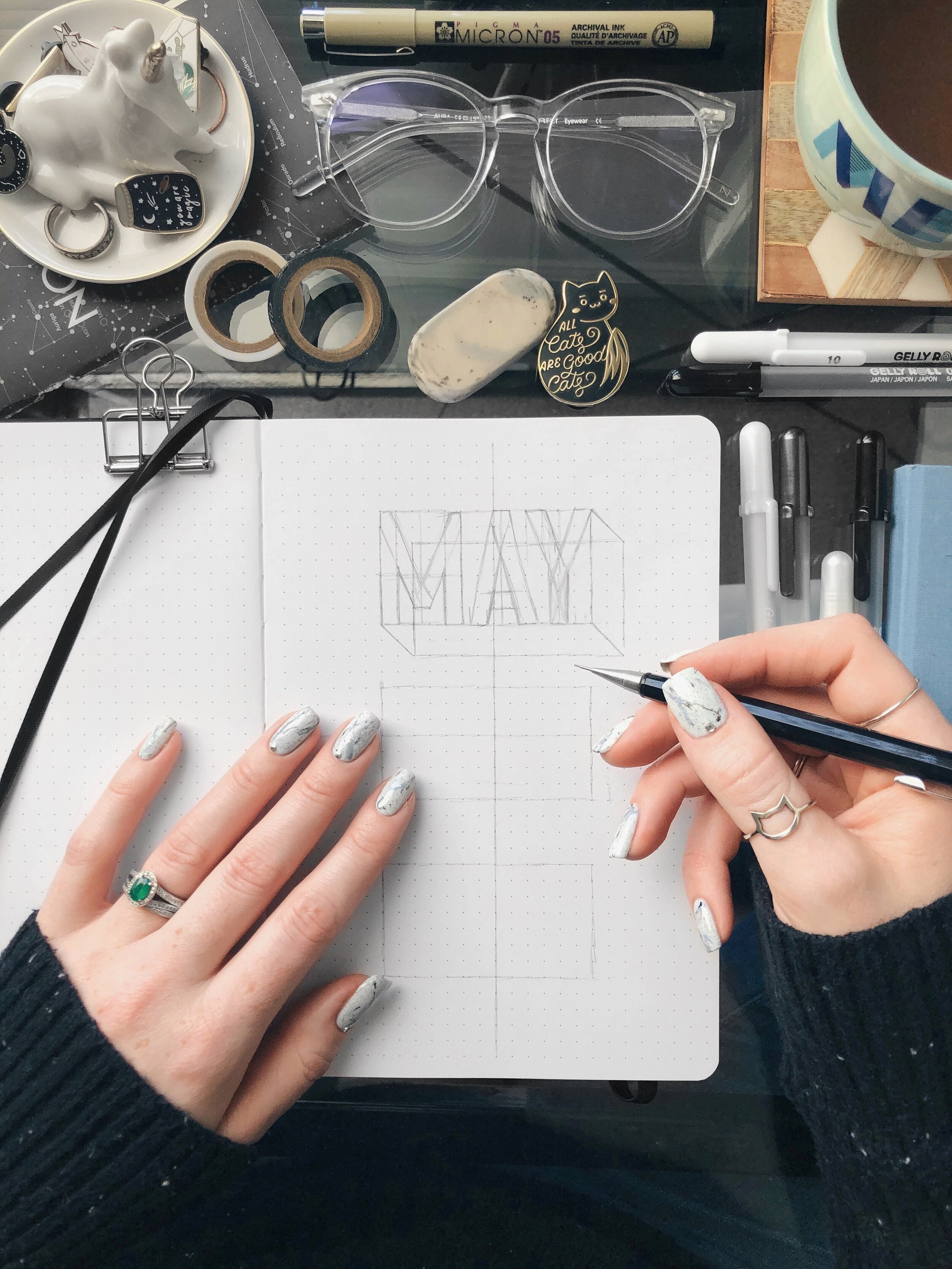
Start Strong
I always start out by using the Grid Builder to create a clean and thoughtful composition. If you tap and hold on brush bundles or single brushes, you can move them around and organize them to make your favorites easier to find. Using the included shapes with guidelines helps you to quickly visualize what your lettering layout might look like, as well as spark new creative ideas. Adding each new shape on different layers ensures that you can move around individual shapes easily without destroying the rest of your work. Once you’re satisfied, simply add a new layer on top of the guidelines and start sketching your letters.
Add Shadows, Shade, Or A Drop Shadow
Once you’re happy with your lettering layout, adding dimension is simpler than it seems. Select the words that you want to add a shadow to, and duplicate them. I recommend naming your layers for a more efficient workflow, and then you can use a two-finger-right-swipe to Alpha lock the shadow layer or just tap it and select “Alpha lock”. Once you see the grey and white checkerboard pattern, you’ll know it’s been Alpha locked; which means that you’re only editing the art that’s on the layer and can’t add anything additional until you unlock it.
Now that you’ve got a shadow layer, fill it with your desired color, make sure it’s below your lettering layer and put it wherever you want! To create a drop shade, simply connect the edges of your letter to the edges of your shadow. It helps to lower the opacity of your lettering layer to better see where they should connect.
Pro tip: If you want to erase with the same brush you’re drawing with, simply hold down on the eraser tool until you see the “erase with current brush” at the top of your canvas.
An easy way to add a blurry shadow effect is to select the shadow layer and use the adjustments tool / Gaussian Blur. Holding + dragging your pencil to the right will add blur, and the more blur you add, the softer and larger your shadow will be.
2. A More 3D Approach
To add even more depth and dimension, alpha lock your shade layer and choose a color that’s a few shades darker than the drop shade. Knowing what angle your light source is coming from is essential because we’ll be adding that darker shade to whatever part of the shade is falling underneath the letter. I like to use a yummy textured brush with low opacity for this.
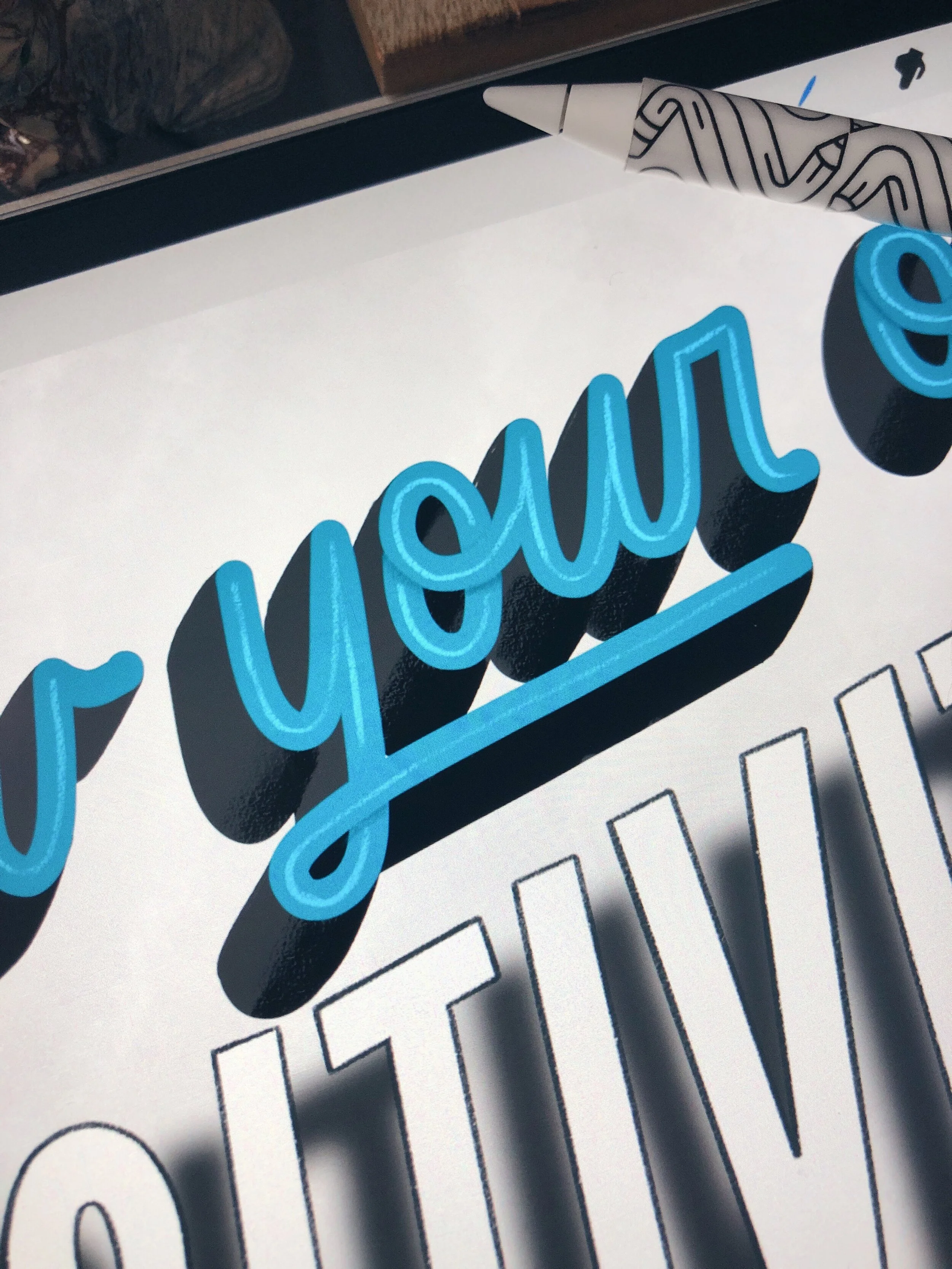
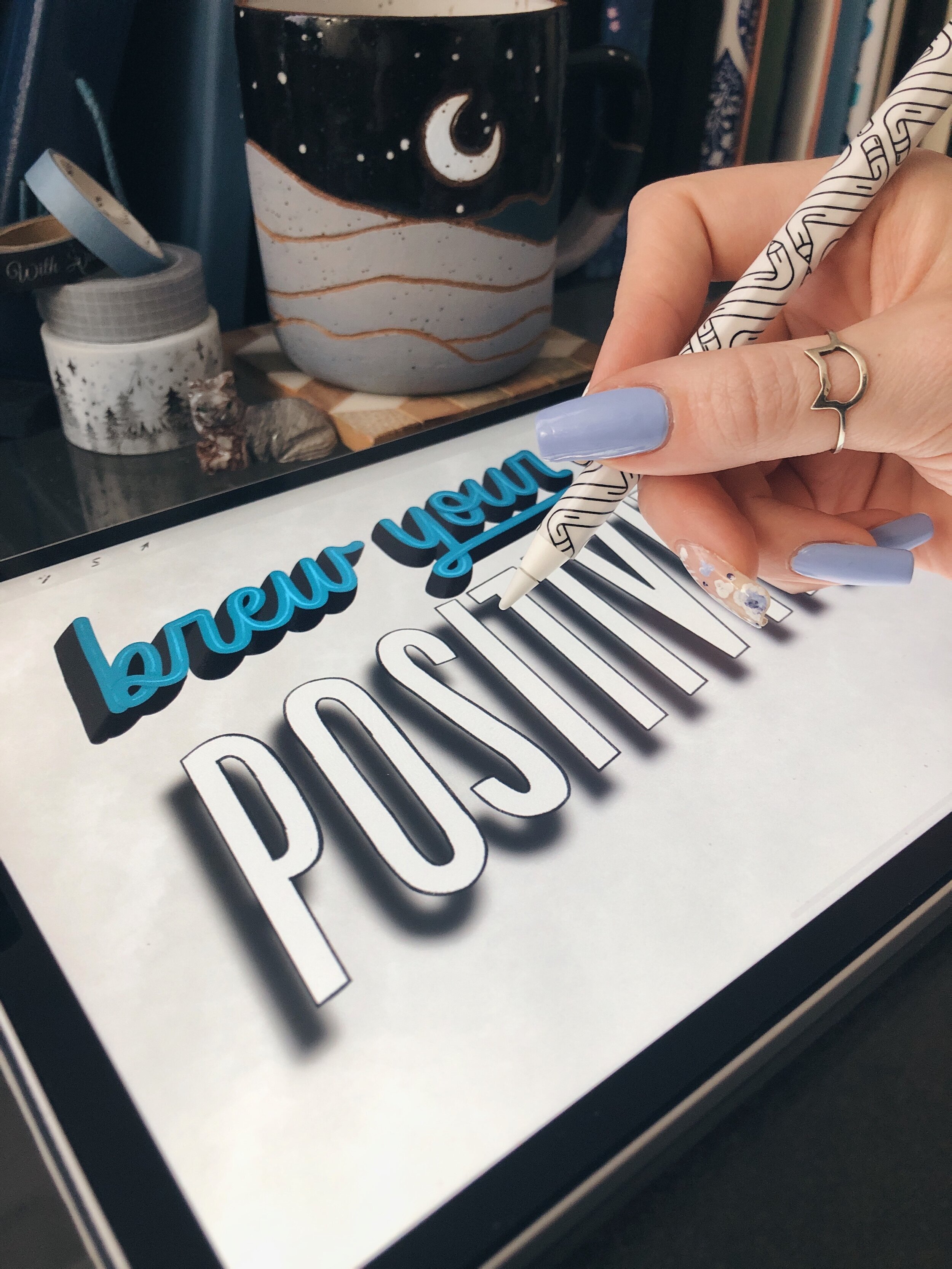
Remember to fade the two shades together if it’s on a curve, and don’t forget to examine all parts of the letter to see where the shadow should fall. I added the darker shade to the undershadow (is that even a word?) to the o in ‘your’ but not to the r - oops! :D
You can also add another shadow to the letter strokes themselves, especially if it’s a script style. Check out the o in ‘your’ again - see how the upper stroke crosses over the lower half to connect to the u? Since we know where our light is coming from, taking a darker shade of teal and adding a subtle shadow on the opposite side of the letter adds another layer of dimension.
Another fun trick to experiment with is locking your shade/shadow layer and using a low opacity textured brush to erase or add another color for more of a grungy/faded look.
3. Add An Inline
Adding an inline is not only another way to add interest to your letters, but to add dimension, especially with script. Take a color that’s a few shades lighter than your letter color and a small textured brush (my favorite is the 6B pencil from The Drawing Box) to add a small line running through your letters. For even more depth, take note of where your strokes cross over each other and fade the parts of the inline that fall underneath.
Examples of inline fonts from VectorStock.com


4. Finish With Even More Texture
A final step that will make your digital lettering pop is creating a textured background! I’ll typically grab a brush from this set, lower the opacity, and add it to my background until I’m happy with it. You can also add a colored background of your choice on a separate layer and use a low opacity texture brush to erase some speckles until you achieve your desired look.
I hope that you found all this info very helpful, and I sure wish I’d had a resource like this when I started lettering! Again, please don’t feel like you need to have an iPad before you even start lettering - I encourage you to just grab any pen and paper you have lying around and try a few of these techniques! And since we went over all things digital in this blog post, the next one will be all about some lovely analog bullet journaling. See you then! :)
<3 Liz