
Answering Your Questions: On Hand-Lettering Consistency
In my last blog post, I went over some ways that you can repurpose your content and make it work harder for you instead of the other way around! So if you haven’t already, make sure to check that out here.

Speaking of content, I recently reached out to my email squad to find out what they’d like to see more of from me, and was thrilled to see so many suggestions and questions from y’all to work through. Y’all really went for it!
One of the questions I got was about consistent lettering - something a lot of you seem to be interested in. So let’s get started with a bit of a lettering lesson!
Note: Some of the links in this post are affiliate, and if you go through them to make a purchase, I might earn a small amount of revenue. Whether or not you decide to buy something is completely up to you. :)
The Q: “I LOOVE how your letters are consistent. It's the same thickness throughout the whole thing. I'm suspecting that you're using a grid system, but the C? And the S? And other curvy ones- mine are sad. Any tips for more consistency?”
Defining Consistency in Hand Lettering
Before I talk you through a few tips on practicing it, I want to briefly touch on what consistency means in terms of lettering.
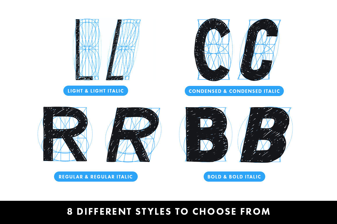
Consistency is something that ties all your letters together and makes them look like they belong together. This could look like a few different things:
Consistent line weight, cap height, descenders, etc.
Flourishes or serifs that repeat throughout
Uniformity in size and spacing
I personally think that consistency comes down to two things: knowledge + implementation - and you can’t have one without the other. You could know how to draw every complex letterform ever made, but without practice your work will still be inconsistent. You could draw letters all day every day, but without the knowledge of how to construct them and what unifies them you’ll be perpetually unsatisfied with your results.
Knowledge
Here are some resources that have helped with the head smarts part of my lettering journey. These range from absolutely free to budget-friendly to collect-these-over-time. But it’s important and ok invest in yourself and your letter education - trust me, you’re worth it!
Free/Budget friendly
Google image search for alphabets and typefaces and study them. Take notes on consistencies and observe repetitions throughout. Try to ask yourself why the type designer made the choices they made. Train your eyes.
Check out books from the library on type design, logos, anything pertaining to letters. Here’s a list of some of my favorite creative books that your library might have on hand or even as an ebook.
Search for handlettering on Youtube, TikTok, and Instagram - you’d be surprised at the amount of free educational resources out there!
Invest In Yourself
Build up your lettering library. Here’s the list of my favorite creative books again, and trust me when I say there’s no need to buy all of them at once. I’ve found them at thrift stores and second-hand bookshops, or borrowed them from friends and passed them on to someone else who might need it. As a starting place, I strongly recommend the Lettering Manual and The Anatomy of Type to help you start thinking like a letterer. Reading a page or two a day is better than no reading at all.


Images from Amazon.com, owned by House Industries, featuring the House Industries Lettering Manual Paperback by Ken Barber
Take online classes. I personally use Skillshare to take lessons from lettering legends like Lauren Hom, Aaron Draplin, Martina Flor, and Adé Hogue. There’s a small monthly fee but you get unlimited access to professional lessons that you can take at your leisure.
Additional online classes. You can take a dedicated lettering class from one of your favorite letterers, and they usually cost anywhere from $50-$500. It’s up to you to decide if that investment at that time is worth it / necessary to you. :)
Implementation
Now that you know how to draw letters, let’s do the thing! Consistency is always a work in progress, but the more you draw letters the more you build that ultra-essential muscle memory and hand-eye-brain coordination. Practice, practice, and practice, even if it’s only a few minutes a day! P.S. - digital lettering is a bit of a different learning curve than traditional ink and paper, but both are important skills to cultivate.

2017

2019
Things that can help with consistency
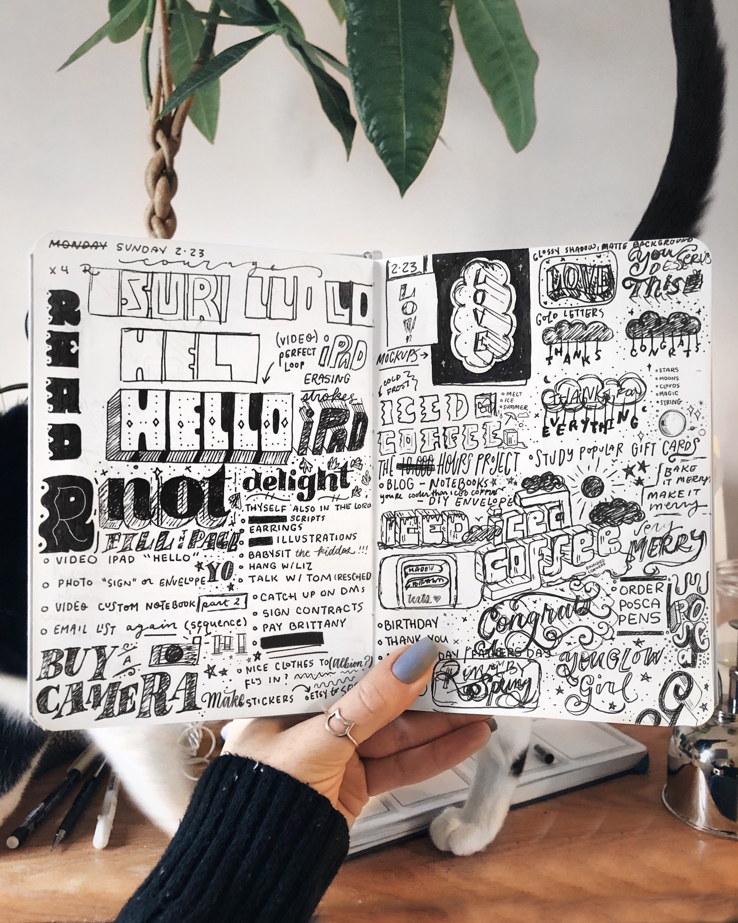
Using dot grid, graph paper, or lined paper. Paper that has guides drawn in can be a huge help in terms of mapping out your baseline, keeping all your letters a consistent height + weight, and more. It’s also a great tool for easily drawing shadows (which I created a tutorial for!). Just don’t get boxed in by the idea that all your work should have a horizontal baseline - have fun with it! The shortest distance between two points is a straight line buuuuut is it the most fun? Maybe not. ;) If you don’t have access to lined paper, create your own guidelines with a ruler!

Use a lettering grid (digital). If you have the digital drawing app Procreate (which is hugely popular in the art community!) then it comes with a built in drawing guide in a grid. Simple go to Canvas, Drawing Guide, and toggle it on. Select Edit Drawing Guide to customize it depending on what you’re working on.
Created and popularized by Ian Barnard and Stefan Kunz, a lettering grid builder can be a time-saver when it comes to creating lettering layouts and consistent letters. With build in baselines, x heights, and cap lines in traditional and fun shapes, it’s an easy way to build a composition and keep things consistent! You can, of course, draw your own guidelines like these or print them out for use with pen and paper, but this is a nice tool for more efficiency.


Along those similar lines, they’ve also created a Letter Builder which has guidelines for building letters as opposed to lettering compositions. It’s easy to create consistency by adjusting the size and angle of each builder grid, and they include tips for construction with different letter styles.

One of my personal favorite grid builders is by Julisha Kim. She has several different packs for several different purposes, and her Guide pack not only has lettering guides with your base line/ cap line, but also horizontal lines, vertical lines, and slants that are just a quick tap away.


Use the circle method. For keeping your letters a consistent weight, try this method with digital or physical lettering. Draw a small circle that’s the width of each of your strokes and compare the sizes - they should all be about the same! Sometimes it’s easier to see the varying size this way instead of looking at the lines themselves.
Turn it upside down. You heard that right! Turn your paper or your canvas upside down to check for consistencies and balance. This can trick your eye into seeing shapes instead of reading letters and can help you spot mistakes faster and easier.
Pro Tip: Spacing
Spacing is one of the best ways to make your lettering look consistent and is just as important as the letters themselves! When it comes to spacing within your letters, I tend to refer to lettering extraordinaire, Martina Flor’s rule:
“The space within the letters should be similar to the space between the letters.”
Essentially, the negative space within each letter should be in proportion to space between two separate letters. The negative space within a letter refers to the space inside a letter frame - for example the space inside the letter O - and is what defines the overall width of that letter. Negative spaces are especially important to determine for curved letters such as C or S.
Before you start lettering, decide if you’re looking to create a narrow, tight composition or perhaps use a wide, thick lettering style. This is where a grid setup can come into play again! Start by drawing one letter on your grid layout, and use this letter as a starting reference point for the width of all other letters you want to add on and as a reference point for spacing.
I hope this answered your questions about hand-lettering consistency, and feel free to save this as a resource you can refer to again and again! :)
If you do find this post useful, please share it with your creative friends and/or leave a comment. Don’t forget that, if you’re a part of my email squad, you can submit similar questions for me to answer on the blog, IG, and TikTok.
Talk soon! <3 Liz